

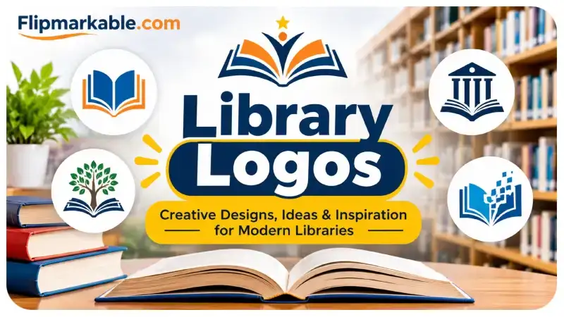
A library is more than a place where people borrow books. It is a space for learning, creativity, research, and community connection. Whether it is a public library, school library, university library, or digital reading platform, a strong visual identity helps people recognize and remember it. This is where library logos become important.
A well-designed logo communicates what a library represents before visitors even enter the building or explore its website. It can express knowledge, imagination, education, and accessibility through simple visual elements. From classic book symbols to modern geometric designs, there are many ways to create a memorable library identity.
In this guide, we will explore different logo styles, essential design elements, practical tips, and creative inspiration for developing an effective library brand.
Why Are Library Logos Important?
A logo plays an important role in establishing a library’s identity. It helps distinguish one institution from another while creating a consistent appearance across different platforms.
For example, a public library may use a welcoming design to represent community learning, while a university library might choose a more professional appearance that reflects academic research.
Here are some important benefits of a well-designed logo:
- Brand Recognition: A recognizable symbol helps visitors identify a library quickly.
- Professional Appearance: Consistent branding creates a trustworthy impression.
- Community Connection: Visual elements can represent local culture, education, and shared interests.
- Digital Visibility: A clear logo makes websites and social media profiles look more professional.
- Long-Term Identity: A timeless design can represent an institution for many years.
A successful logo should communicate the library’s purpose without requiring complicated explanations.
Popular Types of Library Logo Designs
There is no single design style that works for every library. The right approach depends on the institution’s audience, personality, and purpose.
1. Book-Inspired Logos
Books are among the most recognizable symbols associated with libraries. An open book can represent learning, discovery, and the sharing of knowledge.
Some designs use a single book outline, while others combine multiple pages into a creative symbol. These logos work particularly well for school libraries, reading clubs, and educational organizations.
2. Minimalist Library Logos
Minimalist designs focus on simplicity. They often use basic shapes, clean typography, and limited colors to create a professional appearance.
For example, a simple book icon combined with the library’s initials can create a distinctive visual identity.
Minimalist logos are especially useful for websites, mobile applications, business cards, and small profile images.
3. Modern Digital Library Logos
Digital libraries need branding that works across screens and devices. Their logos may include abstract books, digital pages, connected dots, or geometric shapes.
These designs can communicate technology, accessibility, and modern learning. They are suitable for online reading platforms, educational applications, and digital archives.
4. Vintage and Classic Logos
Some libraries prefer traditional branding that reflects history and academic heritage.
Vintage designs may feature decorative typography, traditional book illustrations, shields, or established symbols of knowledge.
These styles can be appropriate for historic institutions, university libraries, and organizations with a long educational history.
5. Creative and Illustrated Logos
Creative logos use illustrations to communicate a library’s personality. They might combine books with trees, stars, reading glasses, or other meaningful objects.
Children’s libraries often benefit from colorful illustrations because they create a friendly and welcoming atmosphere.
Essential Elements of an Effective Library Logo
Creating an attractive logo requires more than choosing a symbol. Every design element should support the library’s identity.
Typography: Fonts influence how people perceive a brand. Serif fonts often create a traditional and academic feeling, while sans-serif fonts generally look modern and approachable.
Colors: Blue can communicate trust and professionalism. Green may represent growth and learning, while warm colors can create a friendly impression. Choose a small color palette that matches the institution’s personality.
Symbols: Books, reading glasses, shelves, lamps, and abstract knowledge symbols can communicate a library’s purpose. However, avoid adding too many elements.
Shape and Structure: A balanced design is easier to recognize. Circular, square, and horizontal layouts can work well depending on where the logo will appear.
Scalability: The logo should remain clear when displayed on a large sign or a small mobile screen.
How to Create a Professional Library Logo
You do not need to be a professional designer to start developing a good logo concept. A clear process can help you make better design decisions.
Step 1: Understand the Library’s Identity
Begin by identifying the library’s purpose and audience. Is it designed for children, students, researchers, or general readers?
A children’s library may need colorful and playful branding, while an academic institution might benefit from a more formal identity.
Step 2: Research Design Inspiration
Explore existing educational brands, typography styles, and creative symbols. Look at different approaches rather than copying another institution’s logo.
Collect a few ideas that communicate the qualities you want your design to represent.
Step 3: Select a Suitable Symbol
Choose one main visual element that connects with the library’s purpose. An open book, for example, is a familiar choice, but you can make it distinctive through shape, spacing, and illustration style.
Step 4: Choose Colors and Fonts
Limit your design to two or three main colors. Select typography that remains readable at different sizes.
Avoid decorative fonts that make the library’s name difficult to understand.
Step 5: Create and Test Different Versions
Develop several concepts and compare them. Test each design against light and dark backgrounds and at different sizes.
Ask potential visitors or staff members for feedback before selecting the final version.
Step 6: Prepare the Final Files
Save your completed design in suitable formats. SVG is useful for scalable graphics, while PNG works well for websites and digital documents. Keep a high-resolution version for printing.
Best Tools for Designing Library Logos
Several online tools can help beginners and experienced designers create logo concepts.
- Canva: Offers templates, illustrations, fonts, and simple editing features.
- Adobe Illustrator: Provides advanced vector-design tools for professional branding.
- Figma: Helps designers create and collaborate on digital design concepts.
- Inkscape: A free vector graphics editor suitable for creating scalable logos.
Choose a tool based on your experience, budget, and design requirements. Always review the licensing terms for fonts, icons, and templates before using them commercially.
Common Mistakes to Avoid
Even an attractive design can become ineffective when it includes unnecessary details or poor design choices.
Avoid these common mistakes:
- Using too many colors or decorative elements.
- Choosing fonts that are difficult to read.
- Copying another library’s existing branding.
- Depending on complicated illustrations.
- Ignoring how the logo looks on mobile devices.
- Using low-resolution images for professional printing.
- Forgetting to check copyright and commercial usage rights.
A simple, original, and recognizable design is usually more effective than an overly complicated one.
Library Logo Ideas for Different Institutions
Different types of libraries can benefit from different visual approaches.
- Public Libraries: Friendly book symbols, welcoming colors, and community-inspired illustrations.
- School Libraries: Bright colors, playful typography, and simple reading-related graphics.
- University Libraries: Professional fonts, elegant symbols, and traditional color combinations.
- Digital Libraries: Modern geometric shapes, abstract pages, and technology-inspired graphics.
- Children’s Libraries: Colorful illustrations, friendly characters, and imaginative book designs.
The most effective choice is one that reflects the institution’s values and connects with its intended audience.
Final Thoughts
A strong library logo helps communicate knowledge, creativity, and a commitment to education. Whether you are developing a new identity for a public institution, school, university, or digital reading platform, the design should remain clear, meaningful, and recognizable.
Start with a simple concept, choose suitable colors and typography, and test your design across different platforms. Most importantly, create an original identity that reflects the library’s mission rather than following design trends without a clear purpose.
With thoughtful planning and the right creative tools, you can develop a professional visual identity that represents your library and builds recognition within its community.
For more information, visit our site daily.















Leave a Reply